ARC Raiders

ARC Raiders is a BAFTA award-winning multiplayer extraction adventure game.
I joined the team in the final year leading up to release to help design the player experience and accompanying UI for the Live Events feature, provide UI design and development support for Codex, as well as help with general UI code fixes across the Frontend systems.
My Role
UX Design | UI Design | UI Development
for Embark Studios,
Collaborators
- UX Lead
- Lily Ekman
- UI Design
- Frank Ortega
- UI Development
- Molly Whittaker, Tori Israelsson
- Event Design
- Anton Rogov
Live Events
- UX Design
- UI Design
The Event designers provided a brief describing a multi-phase, community-wide, Live Event that would start soon after launch and run for multiple weeks.
My Responsibilities
- Define user flows, including integration with existing systems such as feature unlocks
- Design and prototype UI and any supporting visuals
- Present to team leads including UX, Event Designers, Narrative and Production to ensure the design matched expectations
Key Questions
- How would late-joiners experience an active Live Event? Could they join midway through?
- How would Live Events fit into the Onboarding and FTUE?
- How would we balance narrative storytelling and UI clarity when communicating the Event?
The Problem
The First-Time User Experience (FTUE) and Onboarding flows were already very well established and tested when I was tasked with designing the Live Event flow. The Product leads had decided that the first Live Event would happen very close to game launch, meaning almost every new player at launch would be experiencing both the Live Event and the standard onboarding simultaneously.
How could we weave in the Live Event information without causing disruption to the existing flows?
The Process
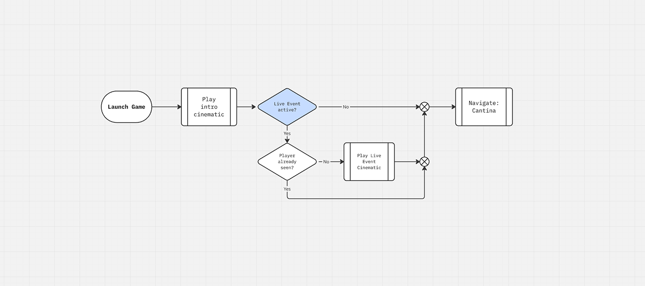
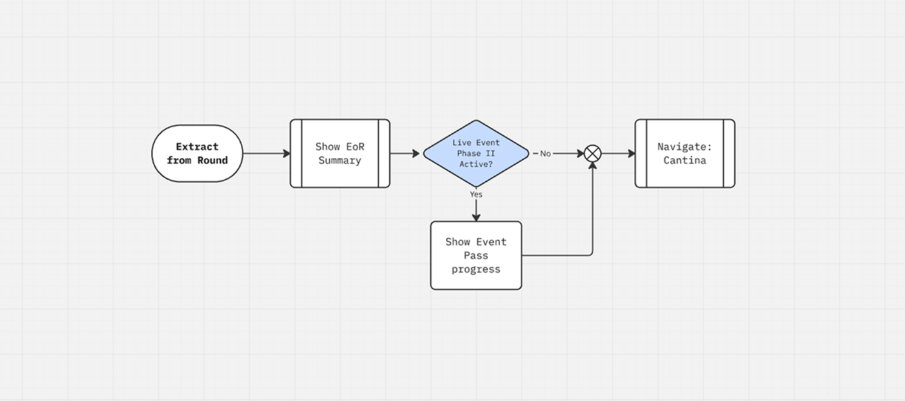
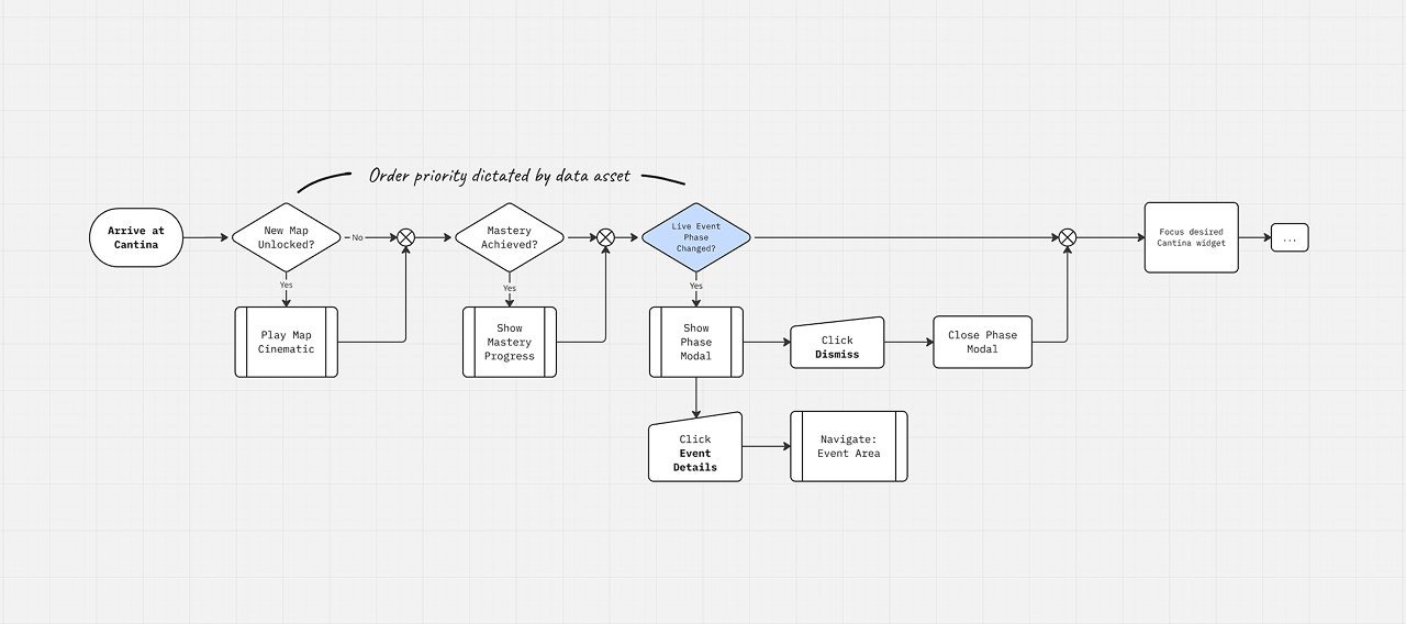
First I mapped out the existing Onboarding and FTUE flows in Miro to understand what type of updates we were showing players as we introduced them to the game. This included Map Unlocks, Character Level increases, Post-round Rewards and Narrative Cinematics. With this information to hand, I could find appropriate points in the flow to inject Live Events (tinted blue in flow diagrams).
My Design Proposal
The "Cantina" screen would serve as the home for Live Events information. This is the place where players land when launching the game and return to at the end of each round and was already the trigger for big progress moments such as Map Unlocks and Narrative Cinematics so it made sense to inject Live Events progress into this existing flow. Additionally, we were already using Cantina widgets for Challenge and Quest information, so adding a new widget type for the Live Event felt like a natural extension.
We would need designs for the following elements:
- Event Summary widget
- Event Phase Change modal
- Event Detail Area: Phase I
- Event Detail Area: Phase II
Event Summary Widget
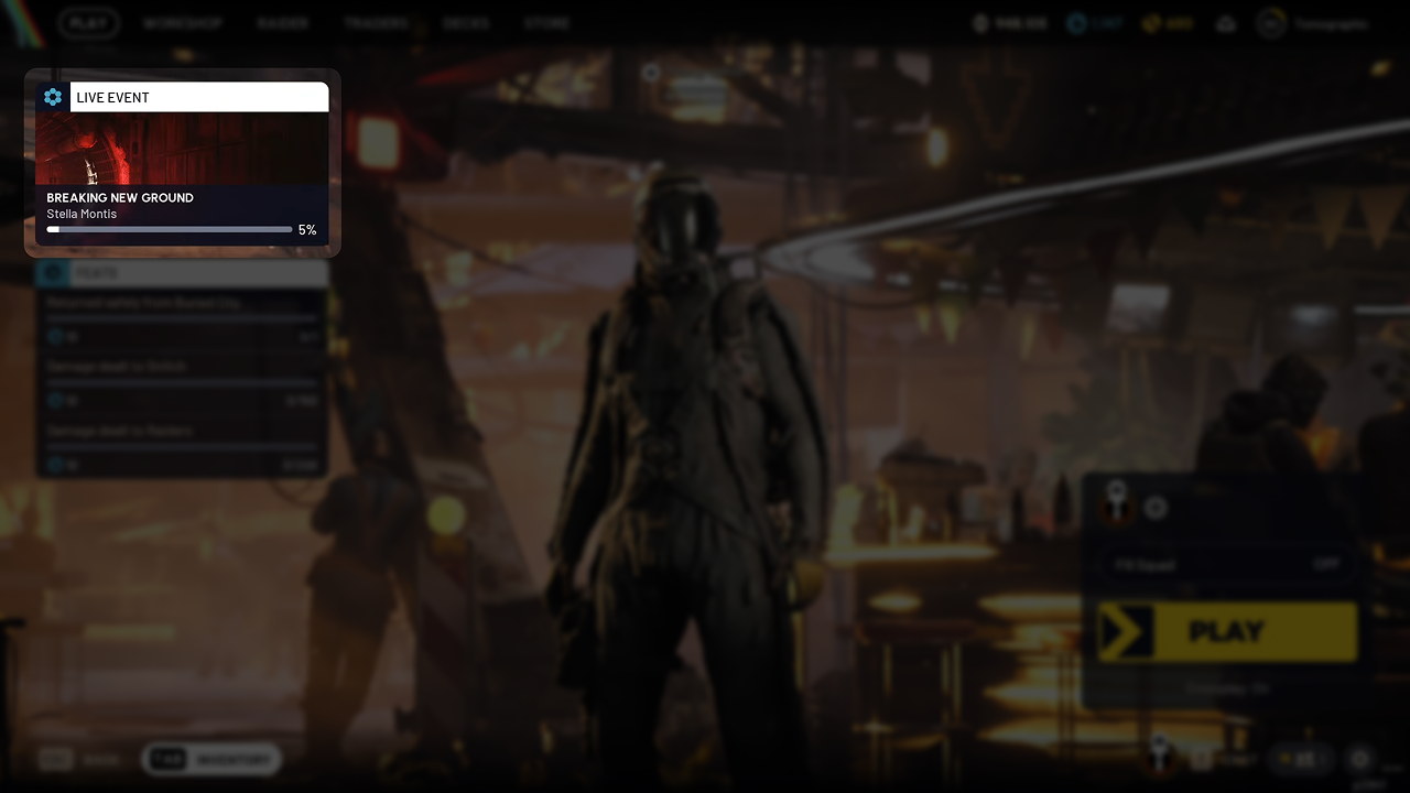
The widget would serve as an overview for the current state of the Live Event, as well as a call-to-action and persistent navigation anchor for players to access the Event area.
There was discussion around if the Live Event data should instead be broken up and woven into other Frontend screens — Event currency displaying in the player's Wallet, progress shown in the core Questline, etc — but we settled on my preference to have a dedicated area in the Frontend, accessible via the Cantina widget, so players would be able to find all of the information easily in one place, which I felt was important in order to help new players understand the separation between the transient Live Event from the game's core content.
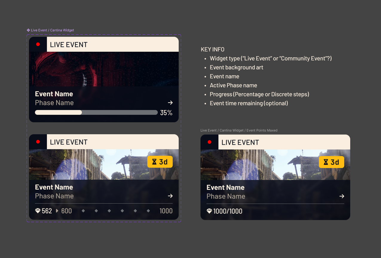
Phase Change Modal
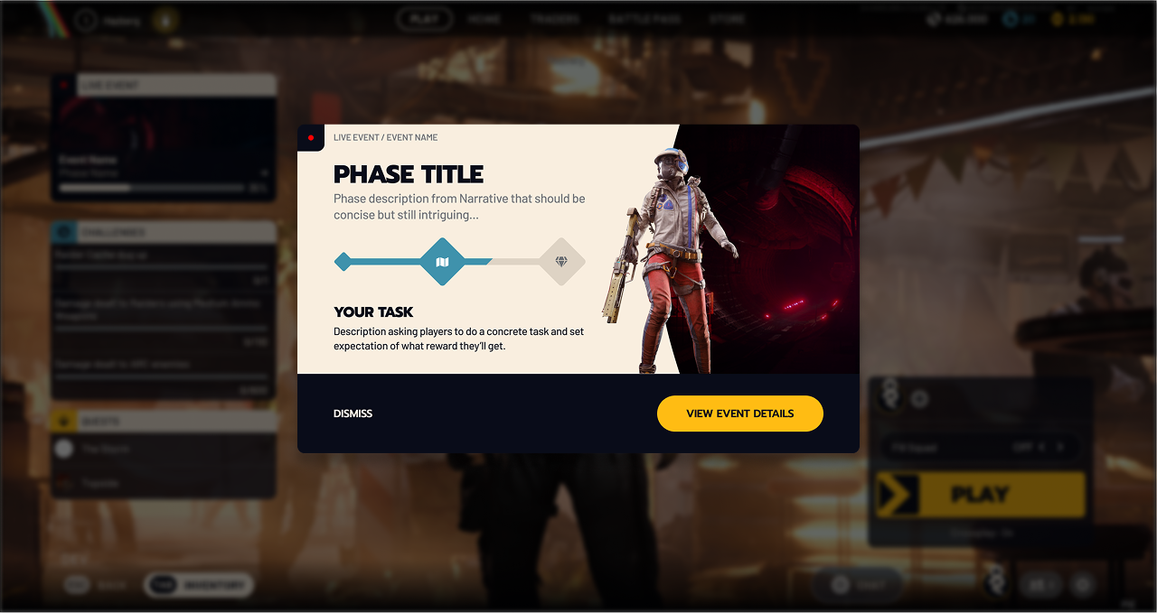
To inform players when the Event has moved to the next Phase, I chose to repurpose a modal notification pattern that the UX lead had introduced earlier in the project.
- The modal would show only to players that have not yet seen the current Event Phase information
- The modal would not show again once dismissed
- All information on the notification would also be available on the Event detail screen for players to re-read if desired
An additional benefit of repurposing existing notification infrastructure for the Live Events was that we could spend development time on other higher priority tasks, which was very welcome given the tight schedule.
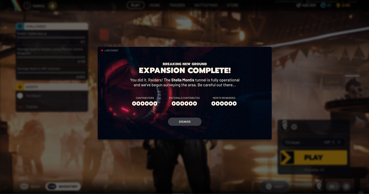
I felt it was important to give closure to players when a Live Event finishes so that they understand why the Event is longer accessible from the Cantina. This would be especially important for players that may have left midway through an Event and returned after the Event is finished.
We decided to show a final summary modal detailing the outcome of the Event within a short time window after the Event's end to players that had engaged with the Event during its active period.
Event Detail Screen | Phase I
The main Event area would provide live and up-to-date information about the current state of the active Event. The Event was split into 2 Phases; the first of which was a shared Community goal requiring material donations to complete the Phase.
I sketched some loose ideas for possible layouts based on the information I had. Details of the Event and Economy design were still changing daily, so I tried to keep the information and layout flexible to give us options.
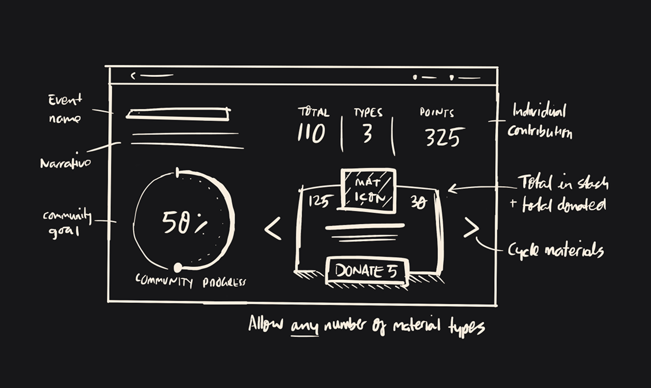
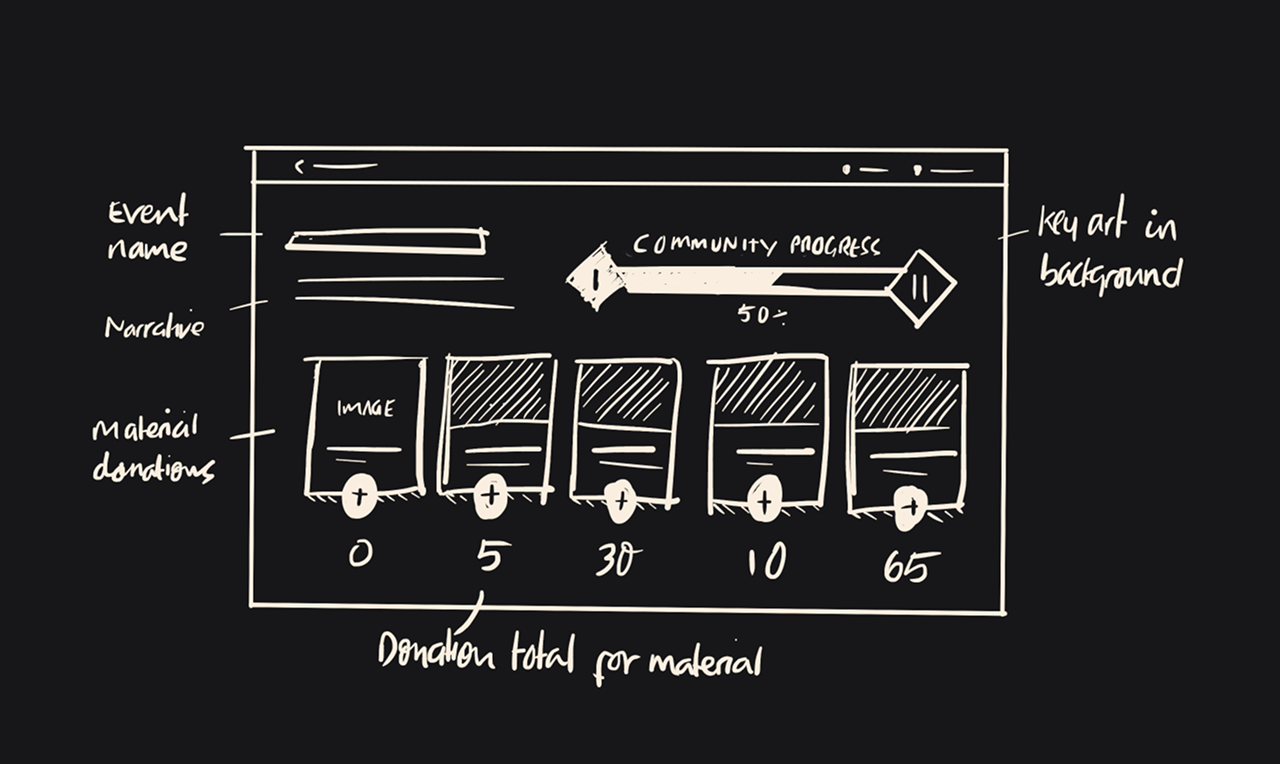
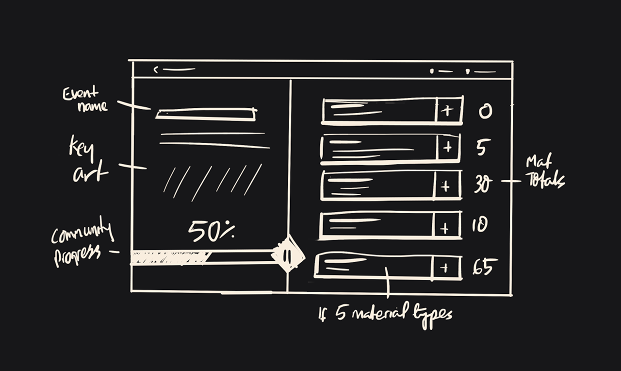
The team liked this version that split the screen — showing the overall Community progress on the left and the Individual contributions on the right. This also created space to emphasize the narrative aspect of the visuals with more prominent key art and event introduction.
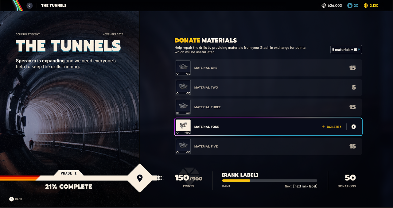
The visual presentation on the Event detail screen made reference to 80s book covers; supporting the retro art direction of the game. After discussions with the art director and UI artists, we changed this tunnel image to be a more menacing red version (See Figure 1.7) as a hint to players that their new destination may not be as welcoming as they hoped.
The core UI was focused on enabling players to contribute any of 5 requested material types from their Inventory Stash. Materials were cheap and easily gained in-round so I decided to provide big, spammable buttons to make donations quick and fun, as players did not need to worry about precisely counting. In return for donations, players earned progress Points and a Contributor Rank.
There was a lot of discussion between Event designers and UX designers around how to present the different layers of progress in Phase I:
- Should individual Points should be capped? (We decided yes)
- Can players continue to contribute towards the Community Goal even after reaching their individual cap? (We decided yes)
- Is a personal rank actually motivating for players? (We decided no)
After coordinating with the team leads, the Points Event currency was renamed to Merits and tied into Phase II and Rank was removed entirely. This simplification really helped to keep the experience focused solely on the transaction of converting Materials to Merits and we saw incredible engagement numbers when the Event went live.
Event Detail Screen | Phase II
Phase II was an individual, multi-page “battlepass”, specific to the Event.
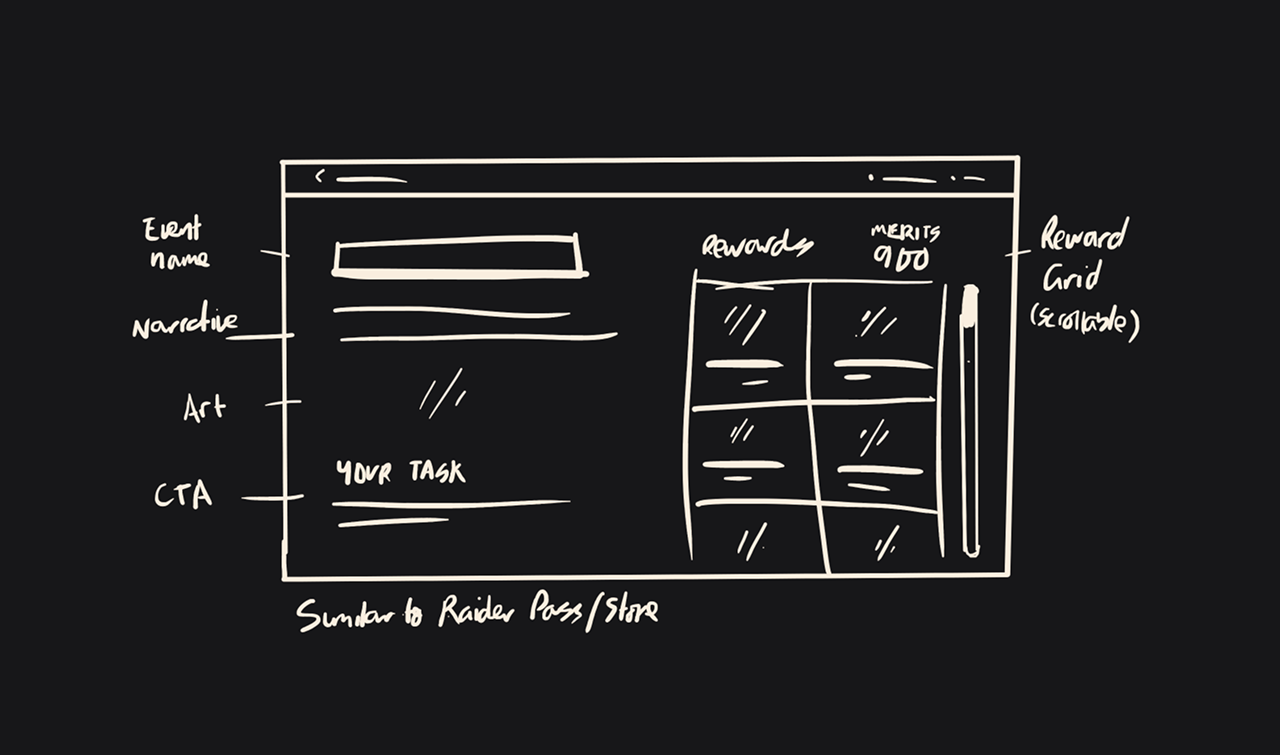
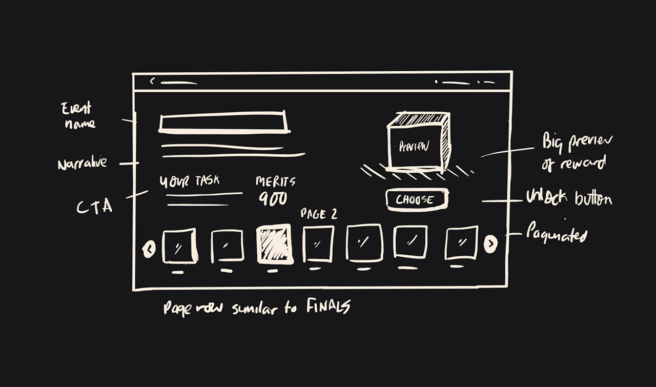
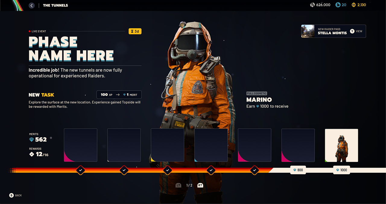
For the eventual design, I used a reward layout that would be familiar to players of similar games such as THE FINALS and Battlefield so they would quickly understand the expectations and outcomes for this phase of the Event. This gave us more space to highlight the beautiful 3D previews the art team provided as well as position the progress bar along the bottom as a continuation of the Phase I progress visuals.
Carrying over the Merit currency from Phase I and allowing space in the UI for narrative text meant players had no trouble understanding the continuation of the Event and we saw excellent engagement in this Phase also, with a huge percentage of players completing to 100%.
The Outcome
The Launch Event was a huge success with millions of players participating during the first weeks after the game's launch. Players quickly became invested in the community donation phase and transitioned into the battlepass with no problems understanding the flow of the Event or the interface, which was great to see.
Additionally, the purposeful effort to keep the UI design flexible meant the architecture was in place ready to reuse, which was an efficiency win for the team for subsequent Live Events.
Codex
- UI Development
- Supporting UX|UI Design
Production brought me in to help finish building and polishing the Codex; A knowledge center feature for players to read about narrative elements they’ve discovered in the world. The core layout was already underway, but there was still a lot of work remaining to fill in the details with a deadline approaching.
My Responsibilities
- Implement UI based on existing designs
- Suggest design improvements based on the tech we have available
- Meet daily with stakeholders including the UI designer and Narrative lead, as content plans were still in flux
Key Questions
- Are the designs possible given our technical setup?
- How do we prioritize the work to ensure we can still deliver if Narrative or Production needs last-minute changes?
- Do UI components already exist that we can reuse, and what are the opportunities to create reusable UI here for others to use?
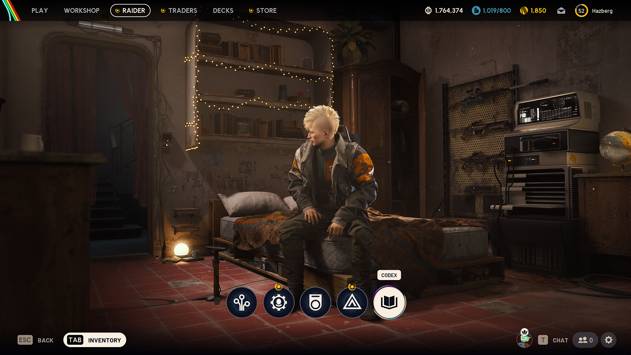
Once we had the basic information such as title, description and images available in view models, I went through and made more subtle UX and visual improvements. These included adding a gradient overlay on each card to darken the background behind the title to ensure sufficient contrast between text and image as well as transition animations and audio feedback to help users follow the active selection.
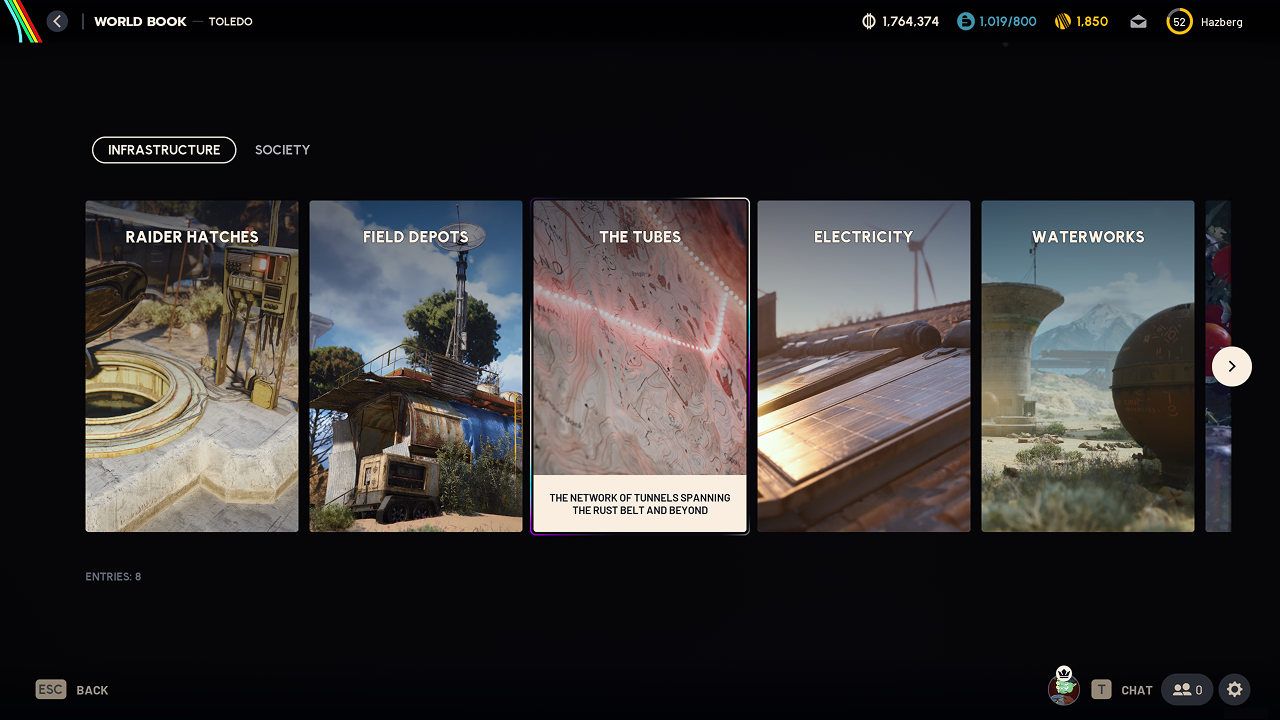
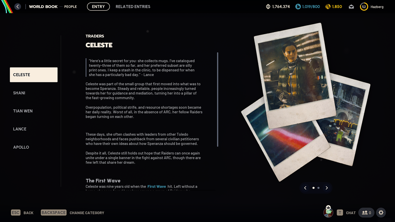
A simple split-view layout providing a scrollable quick-nav list on the left to access other Entries in the same Category, and the full information of the selected Entry on the right.
The most complex aspect of this screen was the Rich Text content, which had many rendering quirks in our version of Unreal Engine and required collaboration with the backend content platform team to ensure our tooling could support the formatting features we needed to match the UI designs.
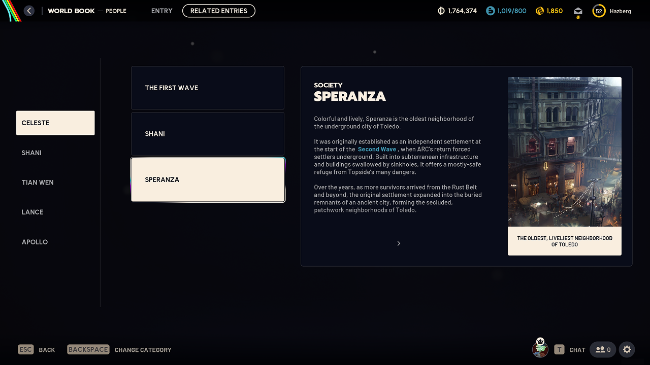
"We have a lot of telemetry data coming from each round. It would be great to give that to the players too..."
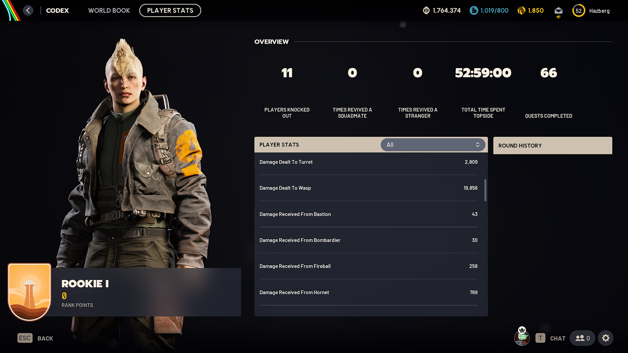
A late request from the product leads was to provide players with a view in the Codex to see the telemetry we collect while the player is in a round such as Player/Enemy encounters and Damage dealt/received.
Frank quickly put together a screen design and Tori hooked up data from the backend for most of the available metrics. I took the initial screen and cleaned things up as well as added the player's current Rank from the Mastery system.
The biggest unknown in this screen was the 3D character preview, which wasn't yet supported in the Frontend. I collaborated with technical artists to repurpose the 3D previewer that we were using for the Item Inspector screen and fortunately we managed to make it work here, which added a strong visual focal point to this screen to really bring everything together.
Ideally, we would've liked to develop the 2D UI design further before launch, but we were still very pleased to be able to give players something that had been requested in earlier public playtests.
Destination Selection: Gamepad
- UI Development
The Problem
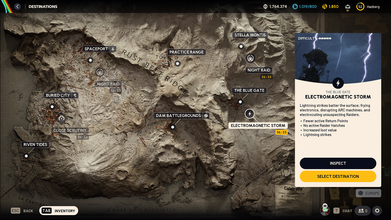
On gamepad, moving focus between destination markers on the map required pressing Left/Right Triggers to cycle backward/forward through the list of destinations. This was slow and unintuitive, as it was not possible to skip destinations and the player expectation from other games was that DPad navigation should work to jump to the nearest destination. The problem worsened as more destinations were added to the game.
My Solution
To improve this experience, I implemented a Nearest Neighbor Search (NNS) helper in our Angelscript Vector2D utilities so that we could move between the destination markers using the DPad. The NNS helper accepts a list of Vector2 points representing the marker positions and a direction vector relative to the focused marker, taken from DPad input, and determines the closest selectable marker in that direction, allowing for filtering of disabled destinations.
The Outcome
The result was that players could now jump around the map moving in any direction to the nearest destination marker. This behavior was much more familiar from other games and better matched player expectations set by the screen design.
In addition, other areas of the Frontend system could use the generic helper for similar navigation/selection patterns in their own contexts, which was a nice UX force-multiplier.
This is the type of UX feature that often goes unnoticed when implemented well, but become a huge source of friction when missing, so it was great to finally fix this for a flow that is used for 100% of rounds played in the game.
These are only a few examples of the tasks I was involved with on ARC Raiders and i'd love to chat more about working on a project like this. It was a huge privilege to contribute to such a phenomenal game!

